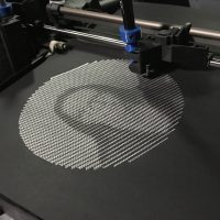
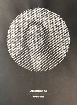
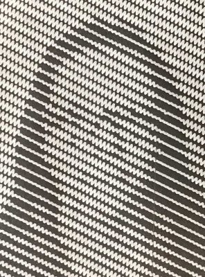
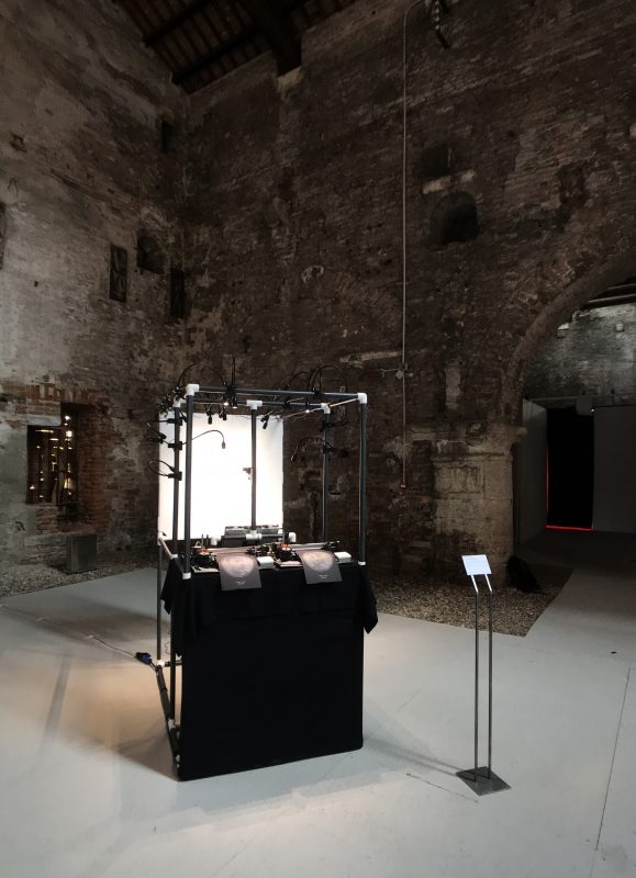
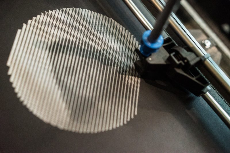
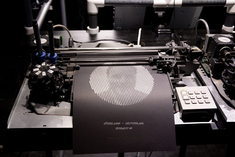
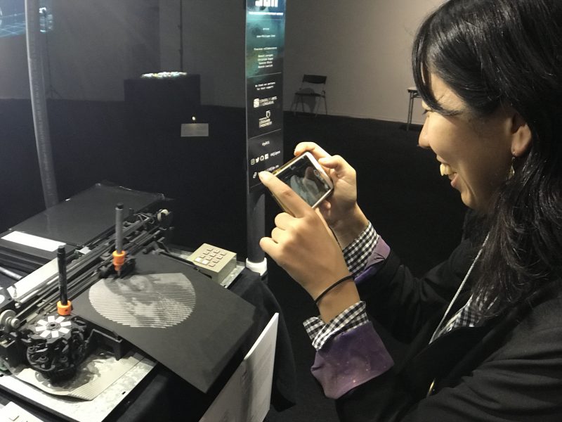
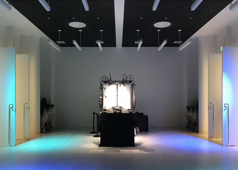
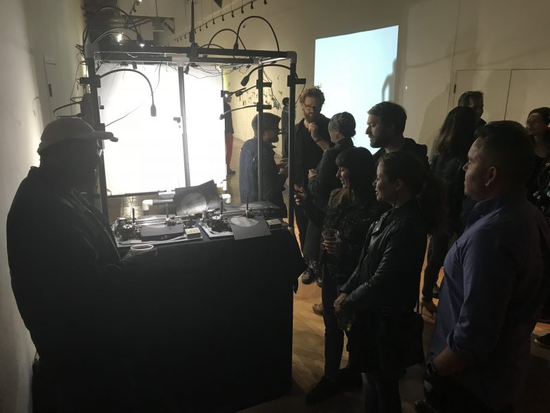
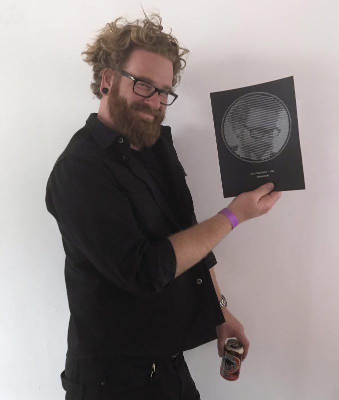
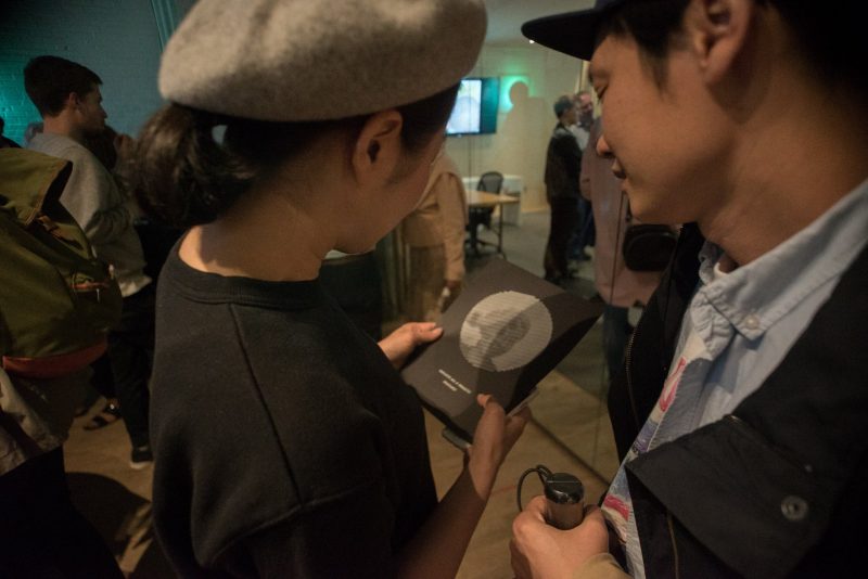
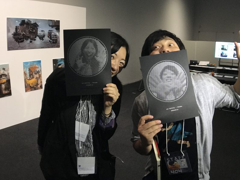
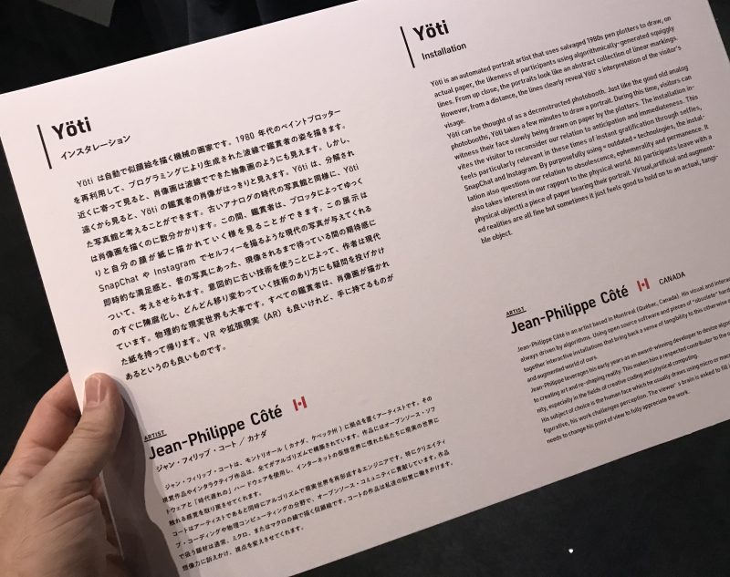
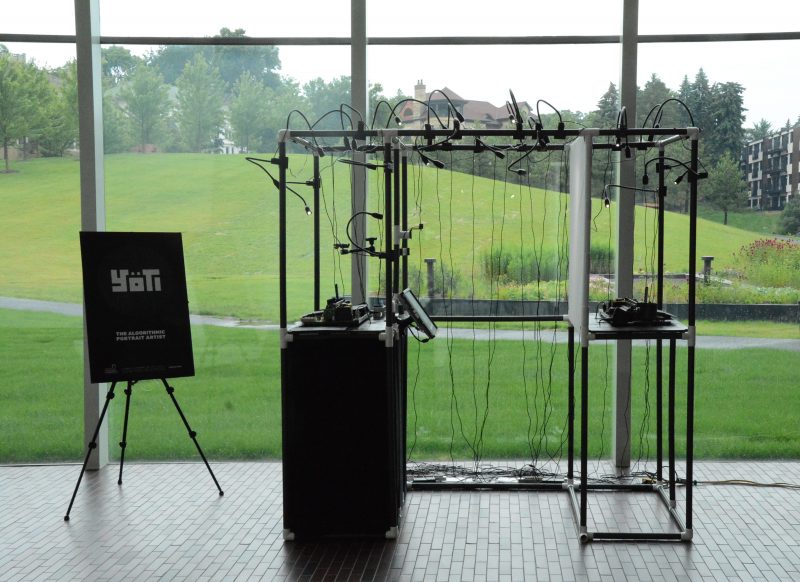
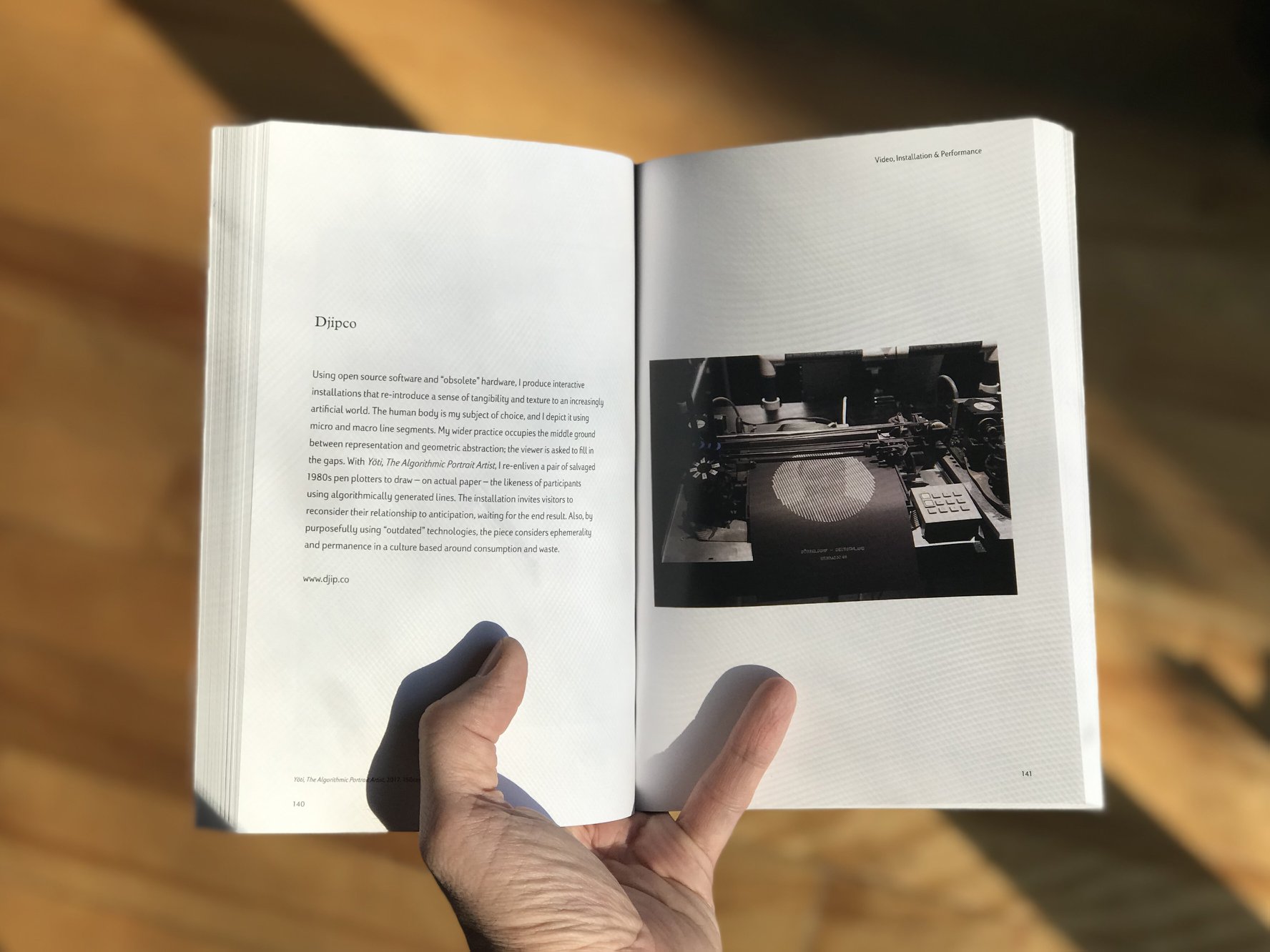
Yöti is an automated portrait artist that uses salvaged 1980s pen plotters to draw, on actual paper, the likeness of participants using algorithmically-generated squiggly lines. From up close, the portraits look like an abstract collection of linear markings. However, from a distance, the lines clearly reveal Yöti’s interpretation of the visitor’s visage.
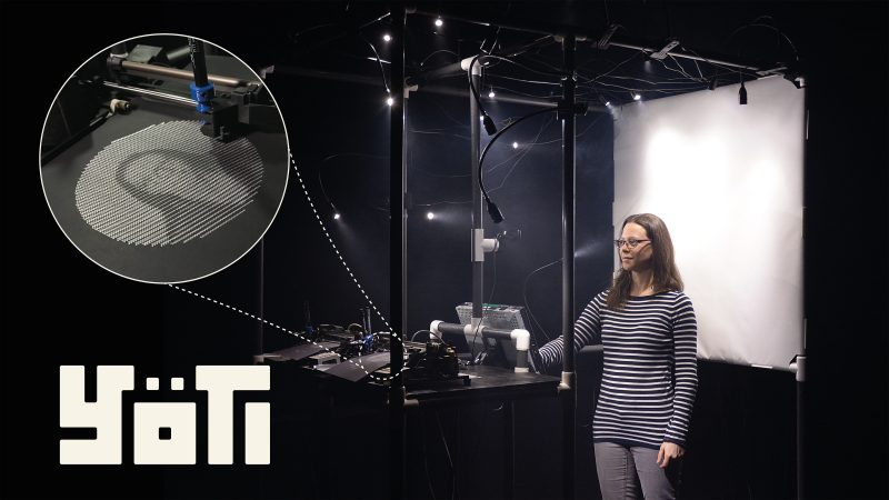


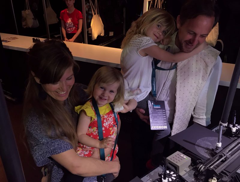
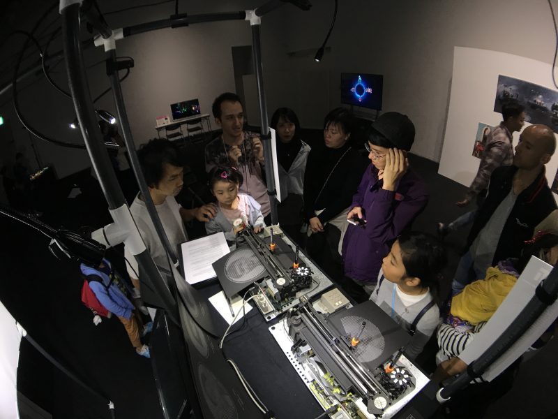
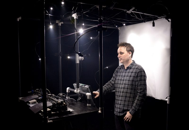
Yöti can be thought of as a deconstructed photobooth. Just like the good old analog photobooths, Yöti takes a few minutes to draw a portrait. During this time, visitors can witness their face slowly being drawn on paper by the plotters.
The installation invites the visitor to reconsider our relation to anticipation and immediateness. This feels particularly relevant in these times of instant gratification through selfies, SnapChat and Instagram.
By purposefully using « outdated » technologies, the installation also questions our relation to obsolescence, ephemerality and permanence.
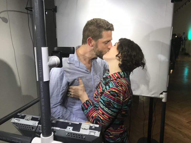
It also takes interest in our rapport to the physical world. All participants leave with a physical object : a piece of paper bearing their portrait. Virtual, artificial and augmented realities are all fine but sometimes it just feels good to hold on to an actual, tangible object.
Public Presentations
Yöti will be, or has been, presented during the following events and festivals:
- ISEA (Gwangju, South Korea, 2019)
- Arte Laguna Prize (Venice, Italy, 2019)
- 404 Festival (Fukuoka, Japan, October 2018)
- Journées de la culture (Lachine & Drummondville, Canada, September 2018)
- Nocturne du MAC (Montréal, Canada, June 2018)
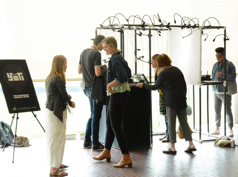
- CODAME Art+Tech (San Francisco, USA, June 2018)
- Chromatic (Montréal, Canada, May 2018)
- beyond tellerrand (Düsseldorf, Germany, May 2018)
- Eyeo (Minneapolis, USA, June 2017)
- Composite #10 (Montréal, Canada, May 2017)
- FITC (Toronto, Canada, April 2017)
Videos
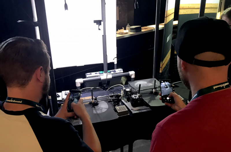
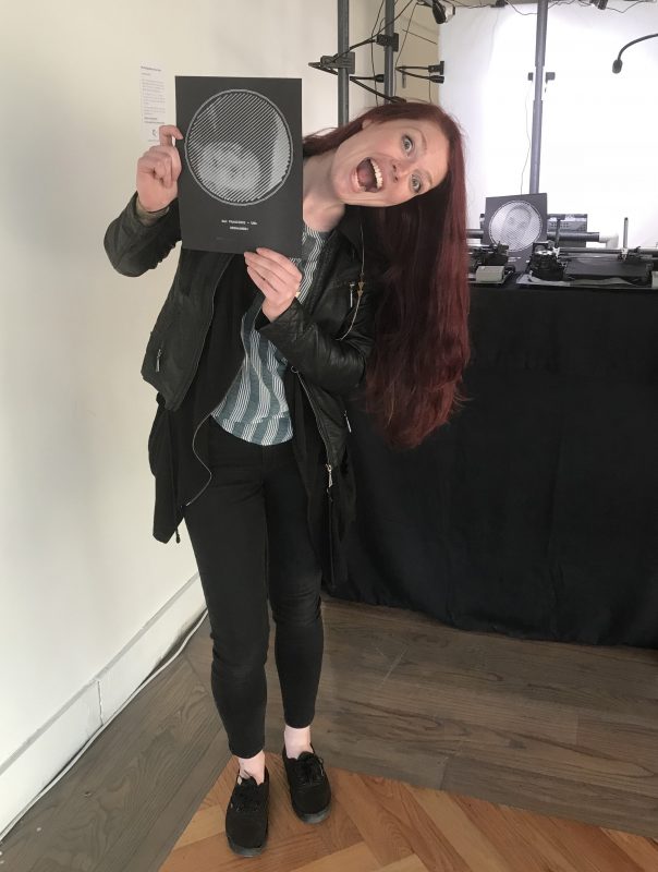
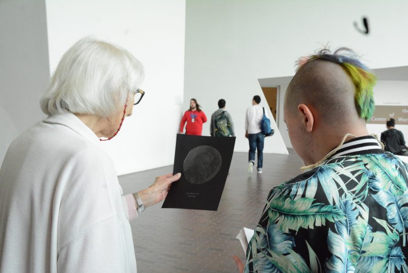
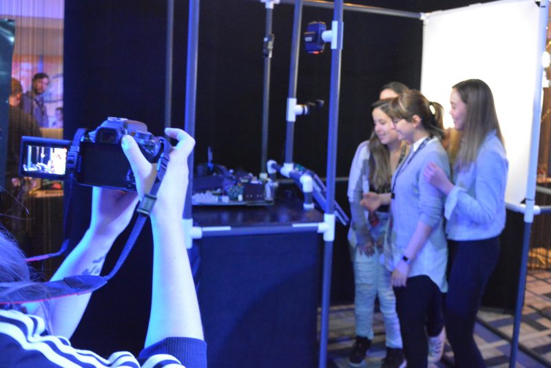
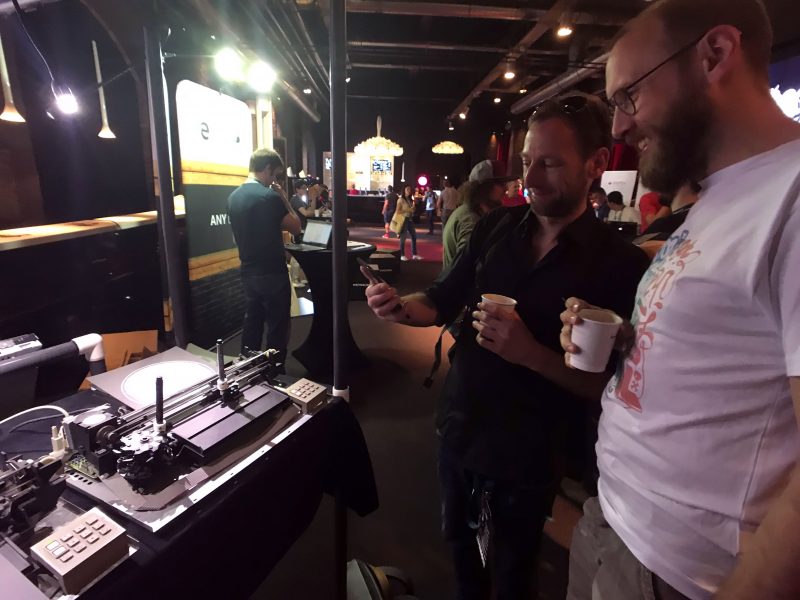
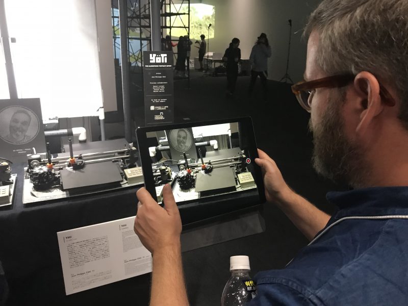
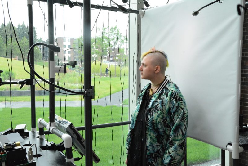
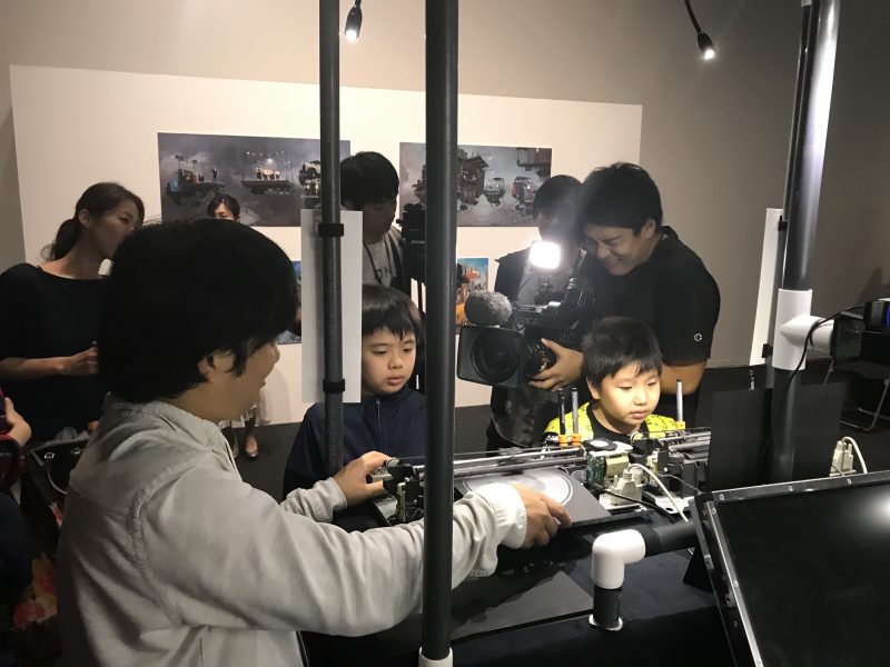
Photos
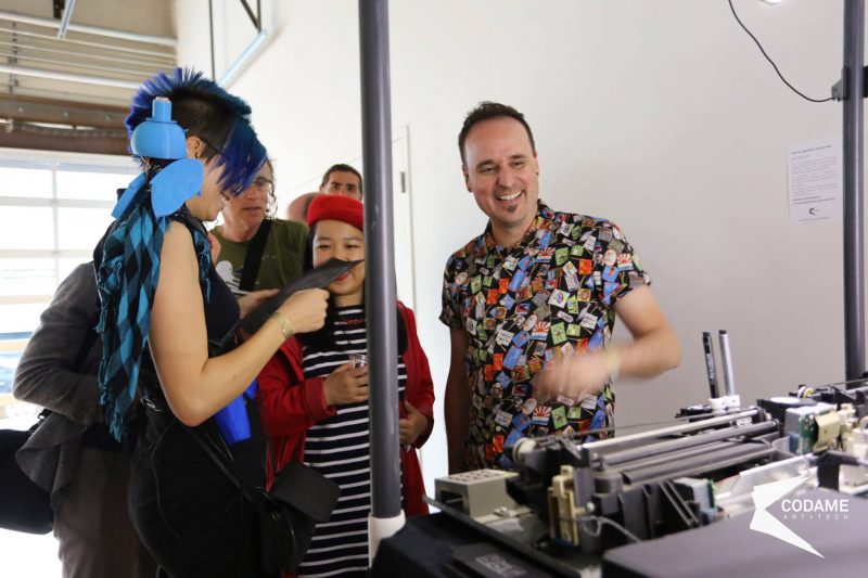
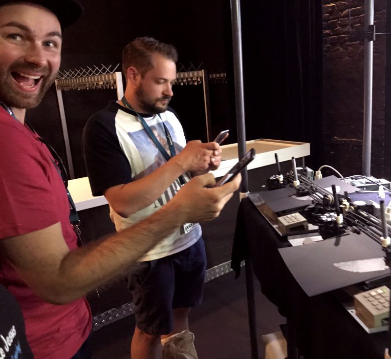
Here are a bunch of photos taken during various public presentations of the project (mostly in Düsseldorf, Montreal, Toronto and Minneapolis).
Awards
Arte Laguna Prize
Yöti has been selected by the Arte Laguna Prize jury as the overall winner of the Sculpture, installation & Virtual Art category. Here is what the jury had to say about the work (translated from italian):
The work impressed with its technical research merging the millenary tradition of the portrait with a deeply contemporary vision of the new technologies that are gaining a foothold in the world of contemporary art.
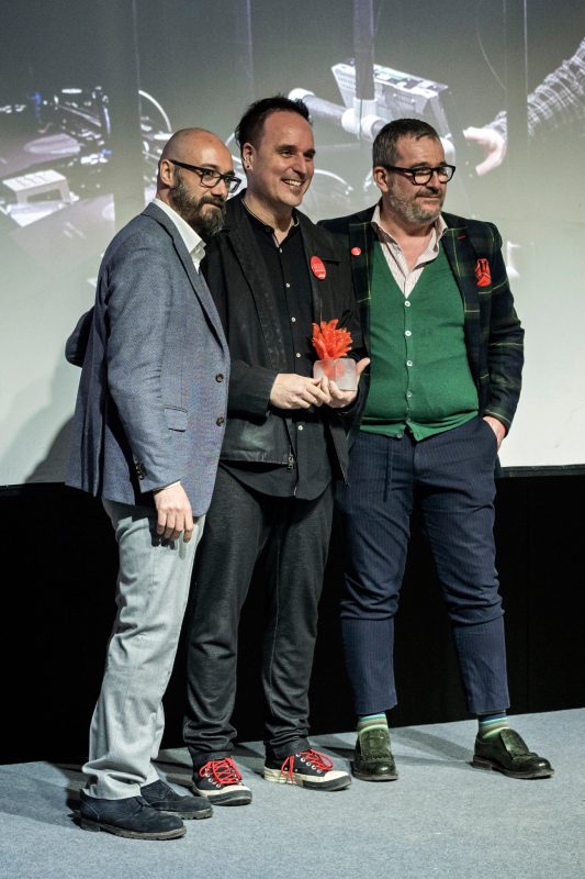
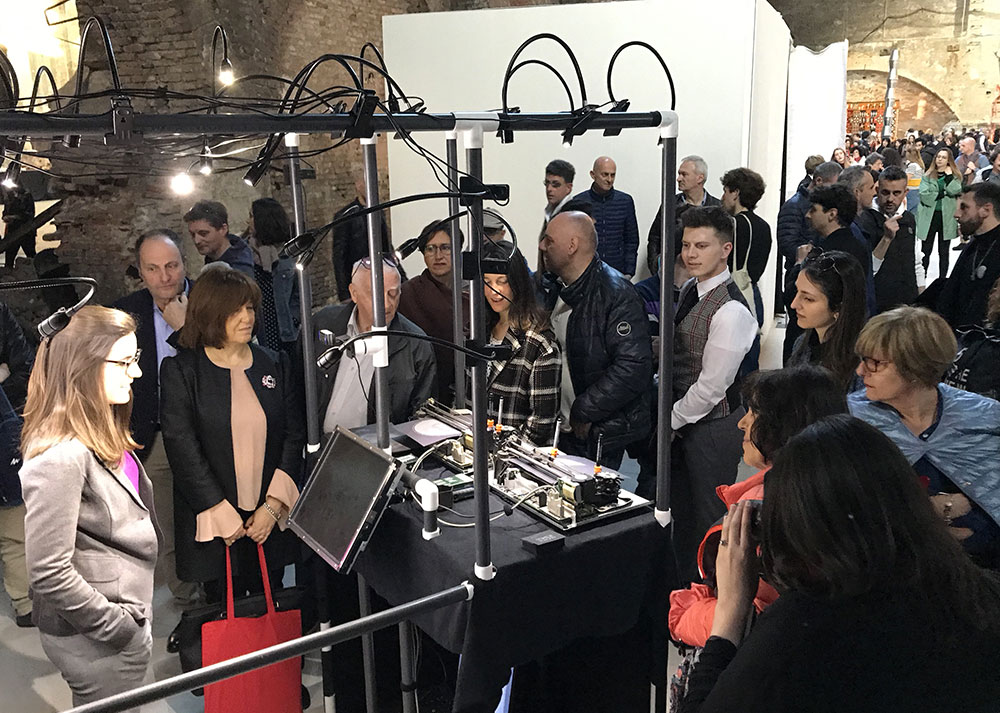
Photo on stage: ©2019, Nicola D’Orta.
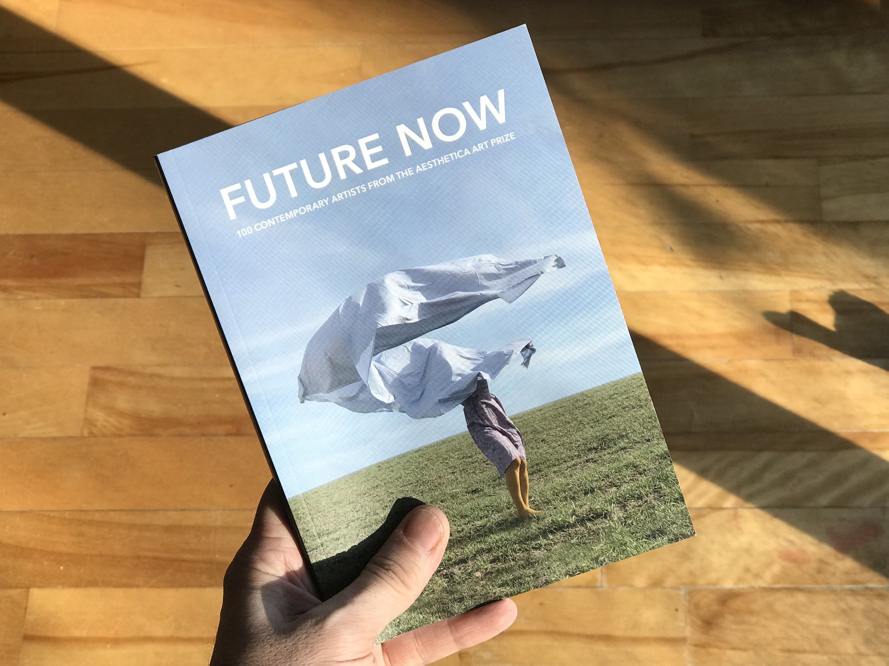
Aesthetica Magazine
Aesthetica Magazine selected Yöti for inclusion in their Art Prize Anthology 2018. As they say: “This book showcases the work of 100 of the most exciting artists from around the world and is a dynamic guide to international contemporary art”
Technical Requirements
The technical rider should answer most questions regarding the physical and technical needs for this installation. If you have further questions, do not hesitate to contact me.
Frequently Asked Questions
Visitors have been eager to know more about this installation, asking questions about the process, the hardware, the software, etc. Here’s my attempt to answer the most common ones:
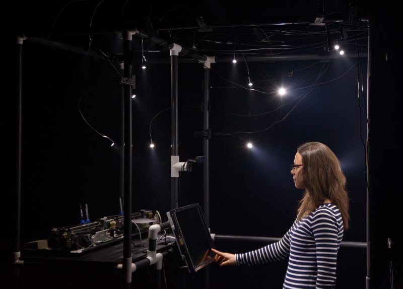
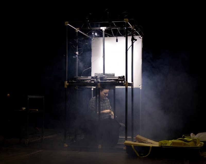
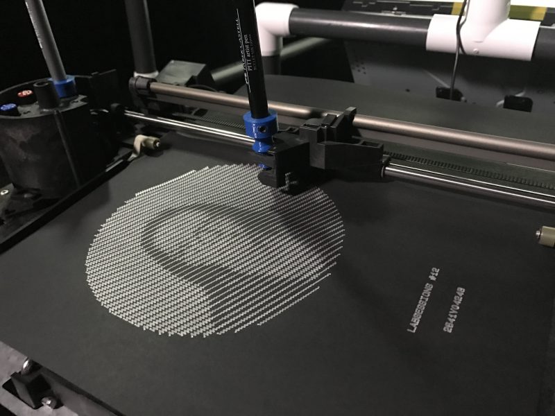
Did you build this (pointing to plotter)?
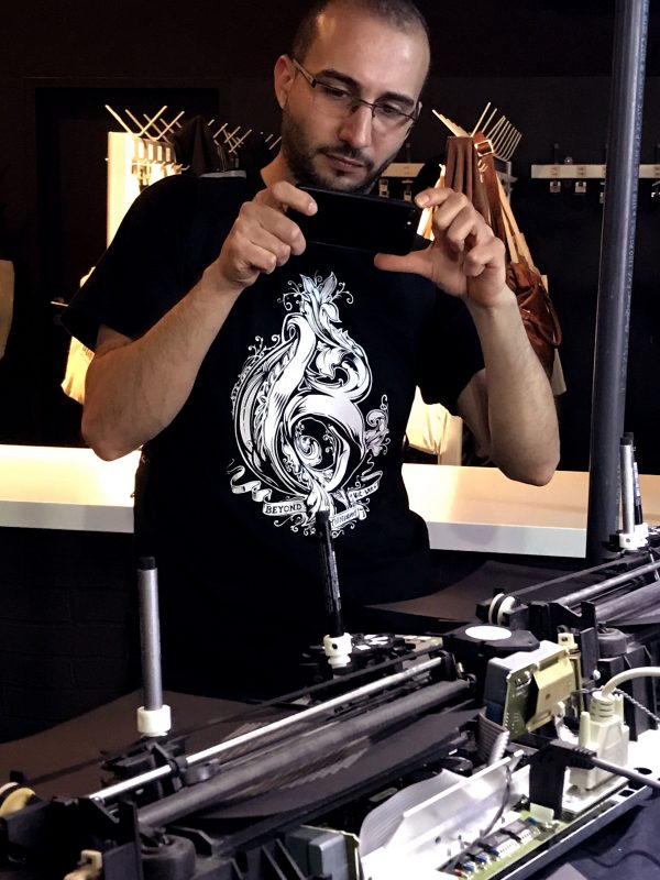
No. The pen plotters I am using were made by HP (then Hewlett-Packard) in the mid-1980s. Yöti uses two HP 7440A pen plotters.
The internals are visible because I removed the beige (and ugly) cover. This way, visitors can see how they work.
Pen plotters were primarily used by businesses to draw charts, architectural drafts and graphs. The 7440A was being sold for USD1300. Larger models could cost as much as a small car.
Pen plotters fell out of favor when laser printers came out. Nowadays, they are used by a few artists and tinkerers who want to give a new life to these old machines.
Where did you get the plotters from?
Kijiji and eBay. If you want to get one for yourself, be aware that I have alerts set up on both these sites to notify me when one comes up for sale. I’m a fierce bidder! HP 7440A plotters are usually being sold for less than 50$. Other models may sell at up to 100$ (such as the more popular HP7475A). Note that the shipping cost will often be more expensive than the device’s price because they are relatively heavy.
As a side note, I should say that all the HP pen plotters I came across (several units, different models) have been working flawlessly despite their age.
What is that thing (pointing to pen adapter)?
That orange (or white, or blue) thing is a 3D-printed pen adapter. It is the only modification I made to the hardware. By using the adapter, a variety of ordinary pens and markers can be used. Originally, the plotter was meant to be used with pens of a specific form factor that are now hard to find and expensive.
The 3D model for the adapter is freely available on Thingiverse and you can edit it on Tinkercard.
Which markers are you using?
I am using Faber-Castell Pitt artist pens (1.5mm nib). The Faber-Castell pens have a narrow form factor which allows them to fit nicely in the plotter’s carousel.
Markers such as Sharpies can be also used but have to be manually inserted in the pen holder because of their larger width.
What language is driving Yöti? Why?
The software that drives Yöti is built upon NW.js. NW.js is a tool allowing the creation of desktop applications from HTML, CSS and JavaScript. It merges the Chromium browser and the Node.js engine. This allows simultaneous usage of front-end JavaScript libraries and Node.js modules.
I selected this environment simply because I already knew it and felt comfortable with it.
Are you using an Arduino?
No. As boring as it may sound, I am using a very old Linux-driven laptop (Mint distro).
How are the plotters connected to the computer?
The plotters feature a serial port (RS-232-C) that uses the old DB25 female connector. Plugged in that connector is a DB25 to DB9 cable. Then, I’m using a converter to go from DB9 to USB. This converter is using the Texas Instrument USB-serial chipset (do not use the Prolific 2303 chipset, it sucks!).
If you ever decide to get your own pen plotter, beware that some units are equipped with an HP-IB interface instead of the serial interface. This makes them much more difficult to talk to.
Did you create the structure?
Yes! Well, actually I got a great deal of help from my friend and colleague Benoit Lavigne. His skills (and tools) came in very handy. The structure is built out of surplus PVC pipes and fittings. Some parts are glued for stability but the whole thing can be dismantled to fit inside a hockey bag (What did you expect? I’m Canadian!).
The shelf has been cut out of a political campaign sign. Those signs are amazingly versatile. I always keep a few after election day! Vanessa Blais, another friend and colleague, sewed the tablecloth that hides the ugly sign.
Why didn’t you use a tablet instead of this old touchscreen?
Yes, I should have but I happened to have 6 such touchscreens leftover from a previous installation and figured I’d just use them. They are a bit heavy and have crappy contrast but I like the fact that they are recycled. This is consistent with the subtheme of the installation. They actually come from some industrial setting. I bought all 6 for CAD100$.
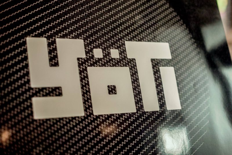
Where does the name come from?
It’s kind of a long story but here’s the gist of it : the original project was meant to be a giant Yeti (the abominable snowman). However, as I built the PVC-based structure, the look of the bare pipes grew on me and I scrapped the original concept (which also tangentially simplified the project quite a bit). However, I really liked the original name and the early versions of the logo that my buddy Christian (Dugas) had created. So I decided to keep the last iteration of the name : Yöti.
The Yöti logo was designed by Nassim Laarich, one of Christian’s students. It was selected amongst several logos that were created as part of an optional assignment in his design class.
The logo was modified after another friend (Benoit Lavigne) suggested the letter “Y” looked a bit too much like a swastika. Not good…
Can you spot the character hidden in the final version of the logo?
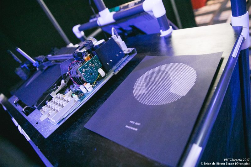
How does the algorithm work?
It’s quite simple actually. A bunch of lines, forming a circle, is laid out on top of the image grabbed by the webcam. The brightness value of he pixels along the lines is then analyzed. The higher the brightness of the pixel is, the wavier the line will be. Areas that feature more squiggly lines appear to be lighter while areas with straighter lines appear to be darker. This is what allows Yöti to draw facial features.
Obviously, the resolution of the drawings could have been higher. That was not the goal. The idea was for the faces to be identifiable, but barely. Finding the sweet spot took some fiddling but I’m quite happy with the result. As it is now, your brain has to fill in the blanks which it usually does if you know the face in the picture. Gestalt, anyone?
More questions?
If you have more questions, post them below and I’ll add them to this FAQ.
Acknowledgements
I would like to thank Benoit Lavigne, Christian Dugas and Vanessa Blais for their very precious help bringing this project to life.
The logo’s design has been created by Nassim Laarich (working under the supervision of Christian Dugas).
This project has been made possible in part through funding from the Conseil des arts de Longueuil, the Conseil des arts et lettres du Québec and the Fondation du cégep Édouard-Montpetit.
 |