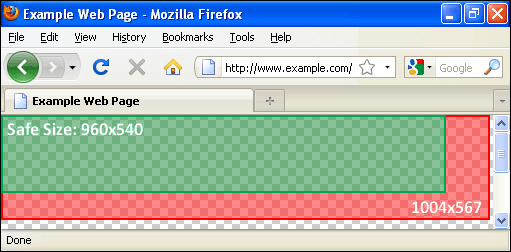
Every web designer is – at one point – faced with that question: “What is the optimal width and height for that new site I’m working on ?“. Let’s try to answer that question using common sense and a little tool I developed which I dubbed the “Browser Screenshot Compendium”.
Every experienced web designer understands that there is a substantial difference between the screen resolution and the usable content area of a browser window. Unfortunately, as far as I know, there is no readily available statistics on browser content area size. This is why I created the Browser Screenshot Compendium. It allows web developers and designers to make informed decisions about the size of their web pages.

The Browser Screenshot Compendium is, quite simply, a collection of screenshots of the most popular browsers in 2009 (on both Mac OS X and Windows XP). I am making it available in Photoshop format (.psd). The screenshots are all on separate layers and have been aligned so that you can easily compare the available space between different browsers. All screenshots are based on a screen resolution of 1024×768. According to statistics on sites such as W3Counter and TheCounter (no longer exists), this is still the lowest common denominator in 2009.
As you know, on the web, there is no such thing as “one size fits all”. Therefore, use those screenshots as starting points and adjust them to your target audience. Do not forget the following situations:
- Additional browser, system or application toolbars, sidebars and widgets might be present further reducing the available space.
- The browser window (especially on larger screens and on Mac OS X) might not be maximized. In the compendium, browser windows are maximized in Windows XP and left in their default state (not covering the dock) in Mac OS X.
As you will see in the document, the maximum canvas size is established at 1004×567. This corresponds to IE8’s canvas size which, ironically, is the smallest of the surveyed group. While you could theoretically use that, I personnaly recommend a size of 960×540 (or the usage of a liquid, fluid, jello, elastic or otherwise flexible layout). A width of 960px leaves 44px for widgets, toolbars and icons that may be present on the right hand side. It also is better suited to large screen users who browse the web with their window not maximized. A before-the-fold height of 540px leaves room for that extra browser toolbar that many (willingly or not) decide to install (Yahoo!, anyone ?). Also, both 960 and 540 are easily divided and therefore play well in many grid layouts.
In any case, with this tool in hand, you should be able to make smart and informed decisions for your target audience.
Thank you very much for taking the time to put this together. Also, great touch normalizing the top/left edge of the content pane.
Very good post, thanks a lot.